Invitation Design
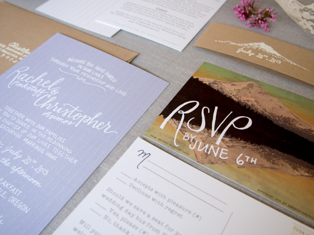
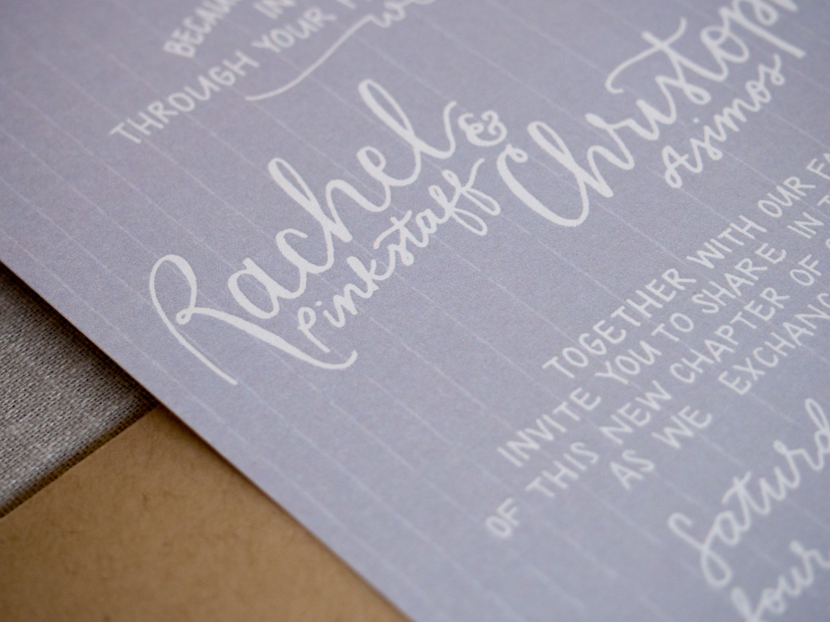
Today I get to show off my invitations! I worked with graphic designer and E&I blogger alum, Kimberly Roth, to create my invitation suite. I love how they turned out.
Along the way, I feel that I really solidified the vision I had for my wedding. We pulled inspiration from the location - Mount Hood, Oregon - by featuring the mountain, the muted lavender color from the lavender fields in the area, and the overall whimsical feel.
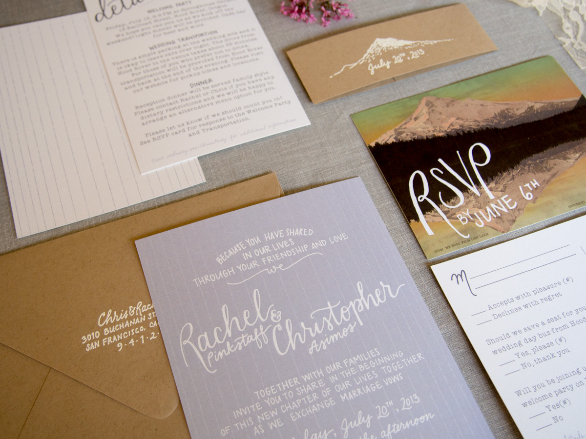 Photo credit: Kimberly Roth
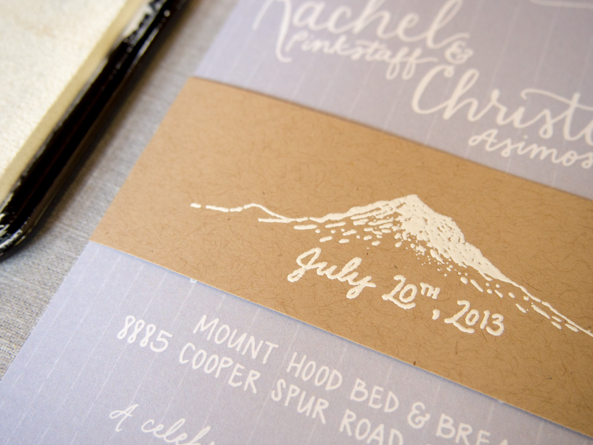
I also got a chance for some DIYing. Kimberly designed and coordinated having stamps made for our 'belly band' and return address. During a visit to Paper Source, I realized embossing with white would show up much better on the Kraft paper than just a white stamp. Embossing is really fun and easy (but time consuming when you are doing it for 100+ invitations).
Here's what I used:
- Stamp
- Stamp pad
Once I got the hang of it, it went by pretty fast. I would stamp three at a time, apply the powder, lay them out on the table (until it filled the table) and then use the heat tool on all of those. Much faster than doing the whole process for one at a time. Two of my bridesmaids came over one night to help and that really speeded things up. Note to self: make sure cat doesn't get to them before you set the powder with the heat. :-)
After embossing, I folded each belly band around the invitation and secured it with a strip of double sided tape.
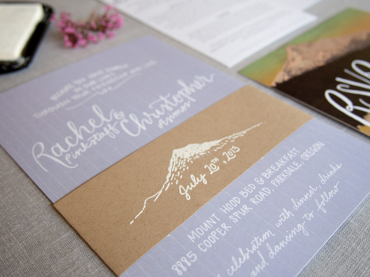 Photo credit: Kimberly Roth

