Invitation Time

We are just about six months out from our wedding – time flies when you are having fun! And with each passing month, we are slowly but surely checking things off our to-do list. Next item to tackle is invitations. My wedding planner wisely suggested picking out and ordering our invitation suite early. Unfortunately, our save-the-dates didn’t go that smoothly – it ended up taking three batches to get them right (if you have any suggestions of what to do with 320 extra save-the-dates, I am all ears!). So needless to say, I am following her recommendation so we have plenty of time to fix any unexpected mishaps.

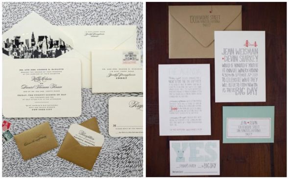
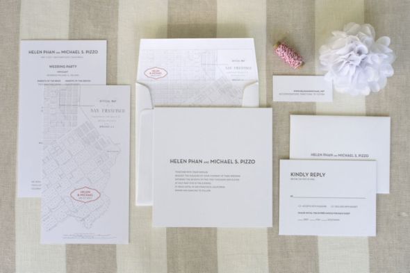
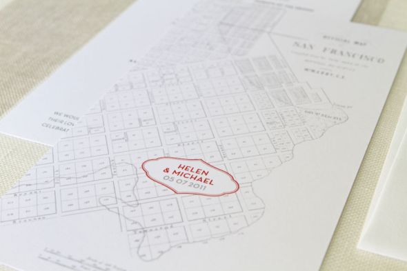
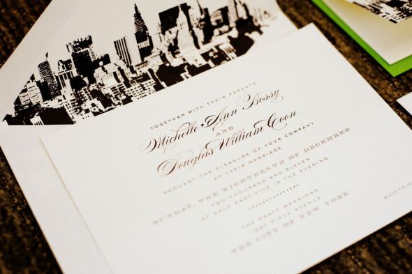
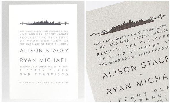
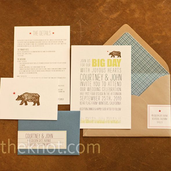
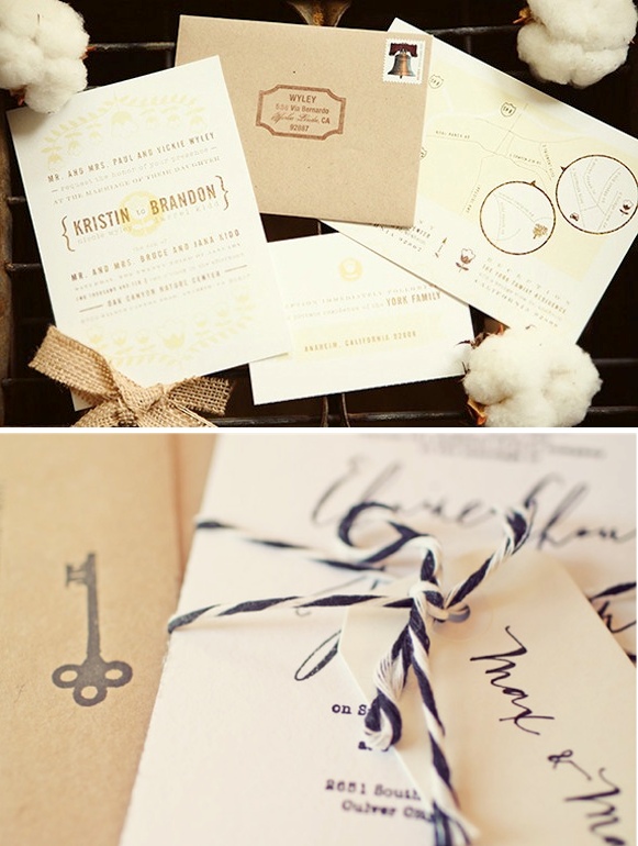
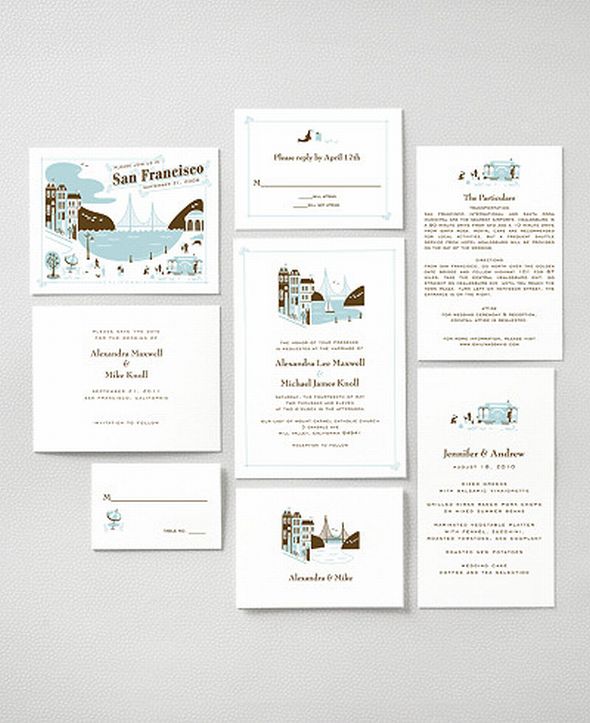
Without really planning it, the city of San Francisco has become the theme of our wedding. I guess when you are planning a wedding in downtown SF and the majority of your guests are out-of-towners, it’s hard not to highlight this amazing place (pretty sure I’ve mentioned how much I love this city!). So it is not surprising that a lot of the invitation suites that have caught my eye are those that showcase the city/place where the wedding is being held.

Credits: 1, 2, 3, 4, 5, 6, 7, 8, 9

What do you think?

And in addition to your thoughts on the above, please post in the comments any and all ideas on what to do with these extra postcard save-the-dates! Maybe a guestbook? Art work? I am open to suggestions!
Inspiration Evolution: The Invitations

We all share of a love paper goods and paper designs. Having a little tag, the right font, a cute logo, etc are the elements that go into the final product of the paper products. Overall, these elements make or break a wedding if you ask me!

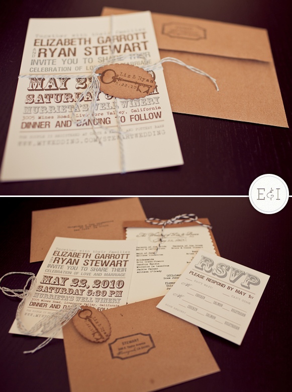
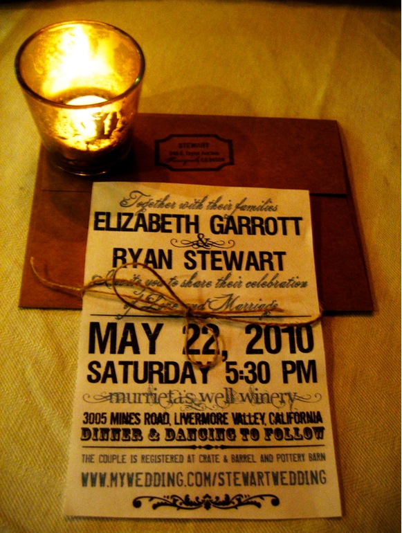
So check out Liz's magic when it came to her invitions! She did every single part herself after countless hours, researching her style, refining the placement, and creating an extremely cohesive element that went with every other aspect of the wedding.

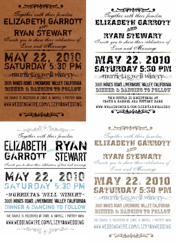
I love creating invitations and paper goods so it only seemed fitting that I do it myself for my wedding. I spent countless hours getting the invitation just right. I loved the style of bold unique fonts that just speak for themselves. I had a return address stamps and logo stamp made for the wedding which I incorporated into the invitations as well to add an even more personal touch. The invitations ended up coming out beautifully. Of course we decided to use kraft envelopes since we love natural colors.

So how did these DIY invitations come about??

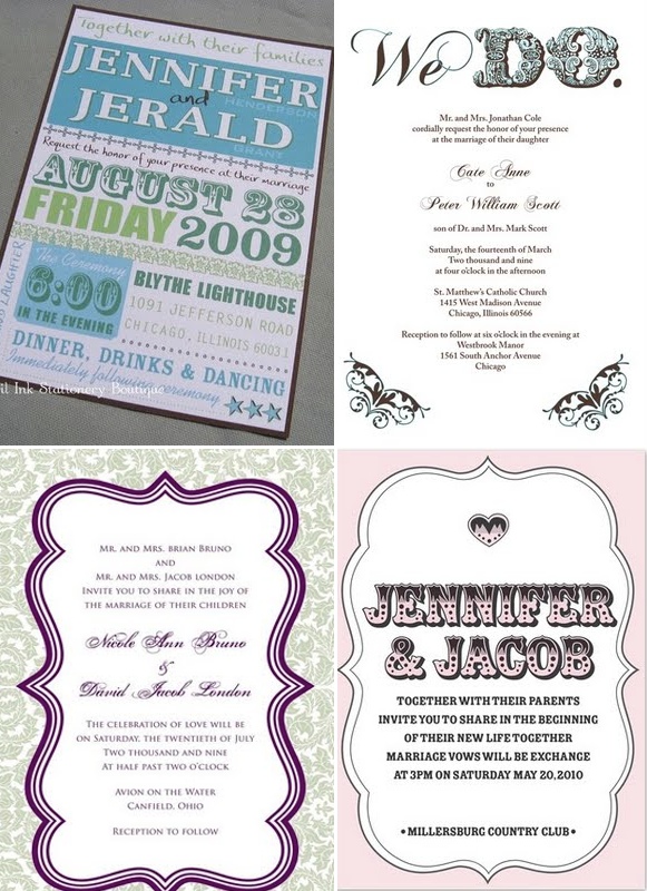
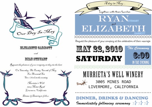
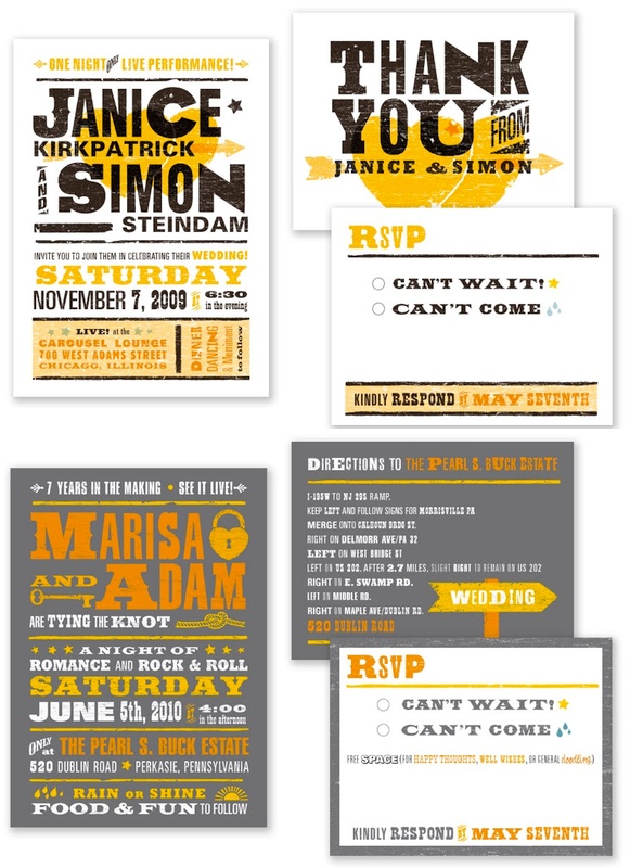
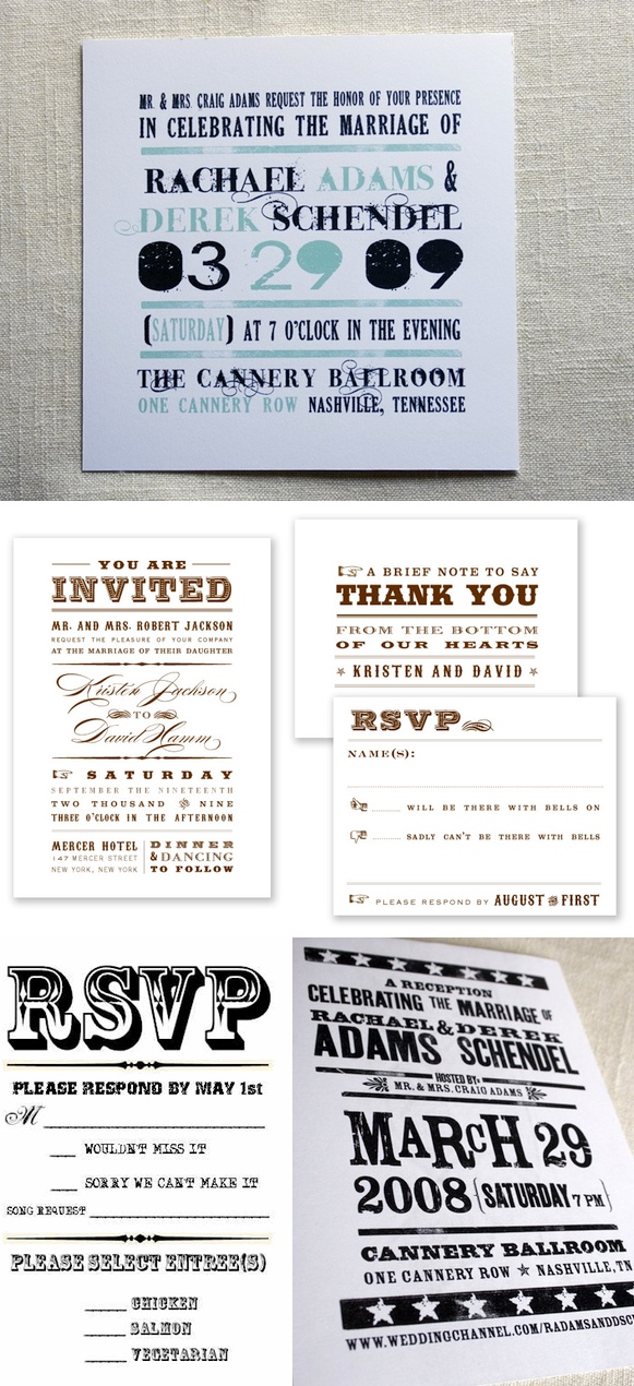
It started with some basic inspiration....

Deciding on the style and the colors.....

Figuring out what fonts and layouts looked best....

Trying some of her own and really honing in on the style of the whole wedding.

Picking the perfect additions to work with the invitations...

Making a few final products...then changing them around again!

Again, here is the finished invitation which I think came out perfect! In the end, it matched the style of the event, incorporated the same details, and turned out to be the perfect glimpse into what was to be expected of her wedding :)

Any DIY invitation makers have some helpful hints???

Photo Credit: All from Liz's blog, Final invite pics by Jason + Anna Photography