 Source: Utah Bride Blog
Remember a couple weeks ago when I was scheming ideas for our ceremony backdrop? Now that the wheels are turning there I'm turning my attention toward the venue entry to see if I can repurpose some of the DIY elements. While I love love the inside of our venue, the exterior is pretty quiet from the street. Its a sleek black storefront on an urban street. I don't dislike it, but I think i'd like to add some elements so that our guests will know that they're entering our event from the street.
I've pulled some ideas of elements we might like to add. Since we have an urban venue, I'd like to find a way to interpret some of these more rustic ideas into something that will make sense for the surroundings.
Source: The Manchiks
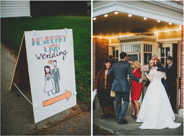
I like the lights in the image above to lend a vintage theatrical vibe to the entry. We don't have an overhang, but perhaps we could find an element to build upon.
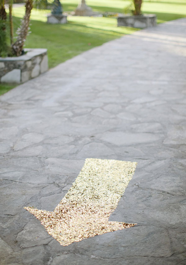
I also love love the idea of a little bling on the ground as guests arrive:
Source: 100 layer cake
I also like the idea of a beautiful sign to bring in some of the design elements we've come up with so far.
 Source: Meg Ruth Photo, 100 layer cake
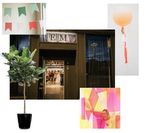
The benefits of our venue entrance are a wide clear sidewalk, a sleek painted storefront and display windows (which we can decorate). [Thats an actual shot of our entrance below] I'm thinking of adding some simple colors to the windows, and outside flanking the entry with some greenery and bold shapes. Perhaps some acrylic shapes mounted to a sleek black archway? I've wanted some large fiddle leaf houseplants, so I'm thinking of buying them for the big day then giving them a sunny home in our living room. And who can resist a giant balloon? Can't wait to see how we can make these all come together.
Sources: Julep (bunting), Southern Botanical (Fiddle Leaf), Matt Shumate (EM Fine Art Exterior Photo) Design Love Fest (Acrylic Backdrop - by Michelle Edgemont), Green Wedding Shoes (Balloon)


