My 'Build the Bar' Bridal Shower

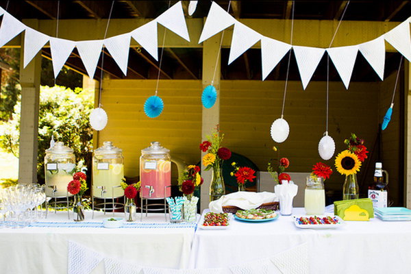
Back in July, I mentioned that my bridal shower was coming up and i was picking out dresses. It was so so wonderful and I thought I'd share with you guys some of the details that made it so special and give some ideas if you're looking to host a shower of your own. Shower 5
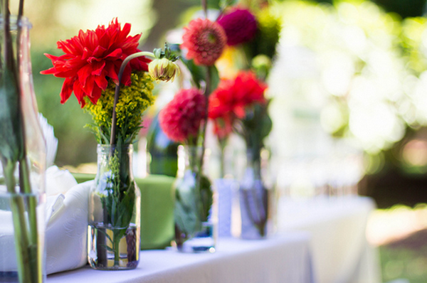
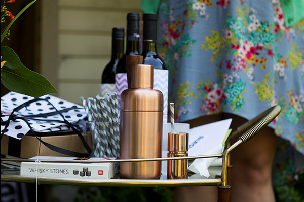
My bridesmaids asked me at the beginning of the summer if I wanted it to have a theme. I do think that its nice to have a bit of a theme to streamline the gift situation so that a smaller group of close women to you don't have to sift through your entire registry. Plus, we were still 8 months out from the wedding so Erik and I didn't really have a good handle on our registry yet. So I was talking to a friend of mine and she mentioned she had recently been to a "Build the Bar" shower and I thought that sounded like a great idea! Long ago Erik and I decided we wanted a nicely designed and well stocked bar in our future home so this was the perfect way to let our friends and family be a part of that tradition.

Shower Main

This week I wanted to just share some of the beautiful images that were captured by our talented friend Rebekah Gough that showcase the details of the day along with some links to the resources that my girls used. Next week I'm going to round up some amazing gift ideas based on what I received if you're looking for something to help someone prettify their home bar. Perfect as we approach the holidays!

Shower 10

Danielle, my Maid of Honor, blogged about the invitations that Minted so generously provided here and here which gives you a pretty good idea of the tone of the party. Perfect colors for me and just that right touch of whimsey.

Shower 7

Shower 4

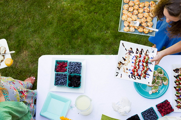
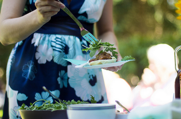
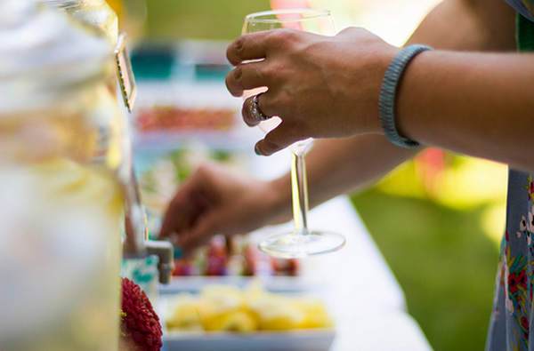
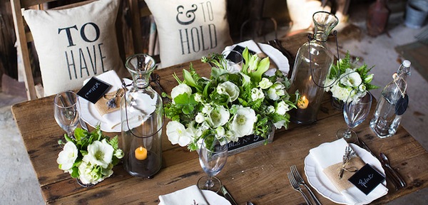
The girls decided to do small bite and cocktail pairings and they found an awesome book called Tiny Food Party that they used. They made sliders, crab cakes, and teeny tiny churros. So amazing! Danielle found milk bottles at Ikea that matched the invitations perfectly and filled them with flowers from our local farmers market.

Shower 3

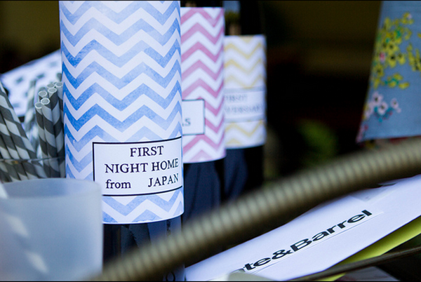
They also used this download from Jones Design Company to make labels for 3 bottles of wine: One for the night we get back from our honeymoon, one for our first christmas, and one for our first anniversary. Such a sweet idea - the gift that keeps on giving (well, for the first year, at least!)

Shower 9

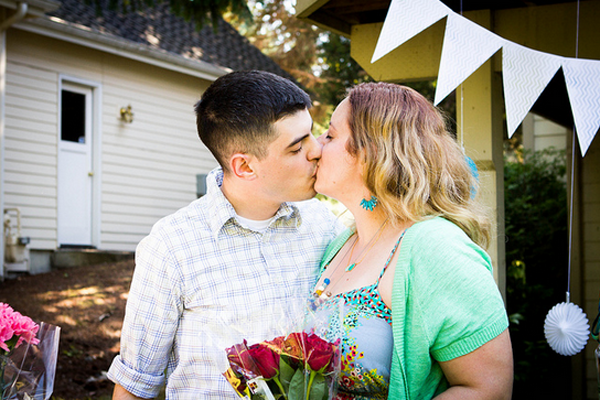
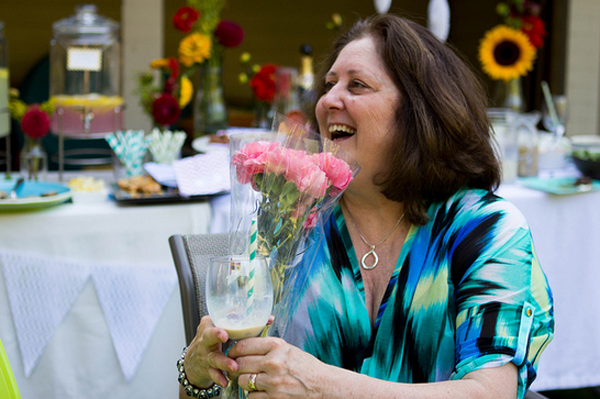
Oh, and my darling fiance stopped by the end of the party to bring flowers for the important ladies in his life (me, his mom, my mom). He's a keeper ;)

Shower 1

Shower 2

It was such a joyful day, and it really was nice to be able to capture that summer sun as part of our wedding festivities since everything else will be late winter/early spring.

Thanks to all my bridesmaids, friends, and family to helped make this day so special and to Rebekah Gough for the amazing photos.
 

Grand Entrance

9c06b54f320776f22d05f2516587c030Source: Utah Bride Blog

Remember a couple weeks ago when I was scheming ideas for our ceremony backdrop? Now that the wheels are turning there I'm turning my attention toward the venue entry to see if I can repurpose some of the DIY elements. While I love love the inside of our venue, the exterior is pretty quiet from the street. Its a sleek black storefront on an urban street. I don't dislike it, but I think i'd like to add some elements so that our guests will know that they're entering our event from the street.
I've pulled some ideas of elements we might like to add. Since we have an urban venue, I'd like to find a way to interpret some of these more rustic ideas into something that will make sense for the surroundings.

Manchik theater wedding

Source: The Manchiks

I like the lights in the image above to lend a vintage theatrical vibe to the entry. We don't have an overhang, but perhaps we could find an element to build upon.

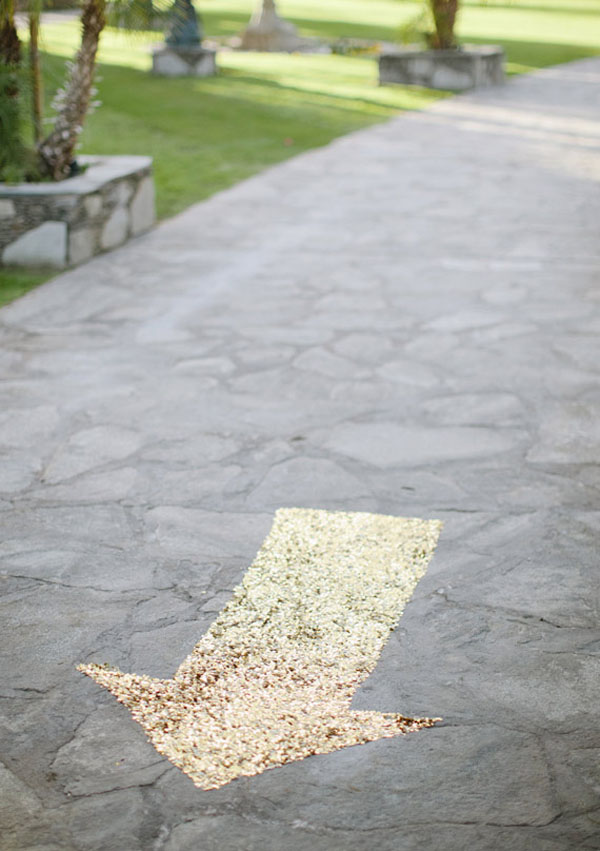
I also love love the idea of a little bling on the ground as guests arrive:

ps3

Source: 100 layer cake

I also like the idea of a beautiful sign to bring in some of the design elements we've come up with so far.

Urban-San-Francisco-wedding-Allison-and-Brandon-30Source: Meg Ruth Photo, 100 layer cake

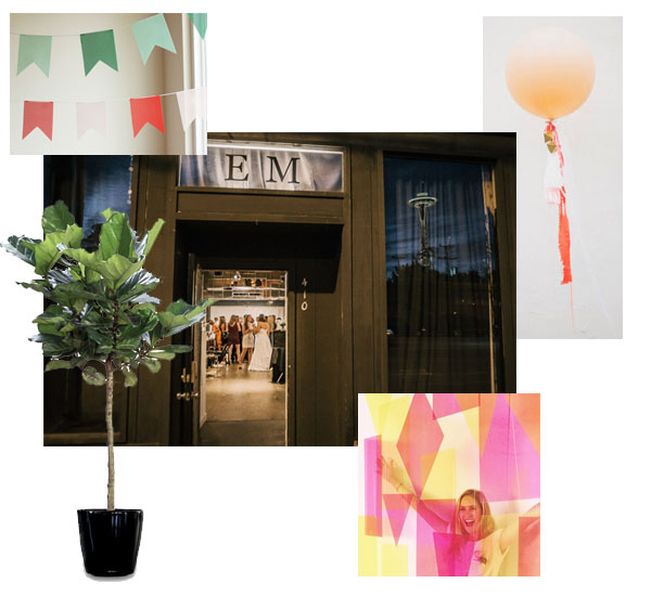
The benefits of our venue entrance are a wide clear sidewalk, a sleek painted storefront and display windows (which we can decorate). [Thats an actual shot of our entrance below] I'm thinking of adding some simple colors to the windows, and outside flanking the entry with some greenery and bold shapes. Perhaps some acrylic shapes mounted to a sleek black archway? I've wanted some large fiddle leaf houseplants, so I'm thinking of buying them for the big day then giving them a sunny home in our living room. And who can resist a giant balloon? Can't wait to see how we can make these all come together.

Entry Decor copy

Sources: Julep (bunting), Southern Botanical (Fiddle Leaf), Matt Shumate (EM Fine Art Exterior Photo) Design Love Fest (Acrylic Backdrop - by Michelle Edgemont), Green Wedding Shoes (Balloon)


I'm Loving Leather

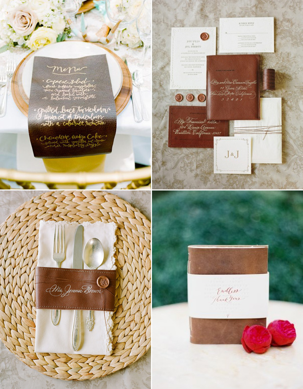
  I'm obsessing over leather when it comes to fashion, interiors and of course weddings! It is a whole new approach to the rustic wedding that we all know and love. Leather can be incredibly sophisticated with a little calligraphy action. Gorgeous right?

leather

1. That calligraphy menu is just to die for. 2 & 3: Jose Villa's wedding had one of the best invitation suite's ever. The mix of organic textures, calligraphy, and of course leather is making my hear skip a beat. Similarly. those place cards from their wedding were so sophisticated. 4. These notepad favors are such a perfect touch for a beautiful wedding.

Ceremony Backdrop

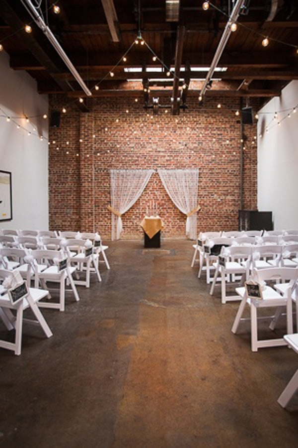
So we've nailed down the venue, I've got a dress, and I'm dreaming about cake. Almost all our vendors are in place (just a couple smaller ones left), so I've left myself start dreaming about the decor. With pinterest inspiration in my face every day, I was wanting to jump into decorations the very first thing. I made myself a deal that I would wait until I had all the big components nailed down so that I wouldn't get my heart set on a decor idea that wasn't feasible for the venue or would clash with some of the larger items. Since almost all those are in place: full steam ahead! The first thing I'm scheming is our ceremony backdrop. The venue already comes with an amazing brick wall backdrop and some lights hanging overhead, but I want some other color and pattern as our main focal point. Something a little more dynamic than the white curtain that has been used in the space in the past:

1a1a1ee4a6ec7d6d51492e6fa252ca2c

Source: Photo Elan

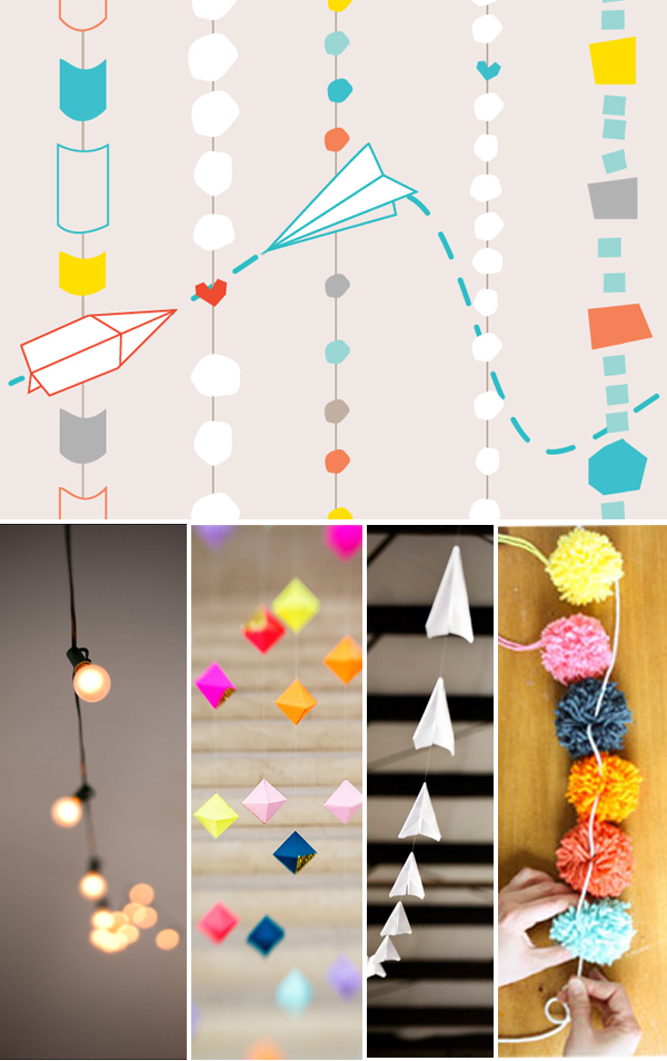
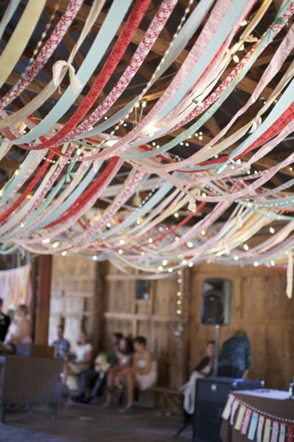
I went back to our pattern and decided that maybe I would just do the simplest thing and re-create it in a larger format, with several types of hanging garlands. Globe lights  (which the pattern was designed around), pom pom yarn balls for the colorful circles, a bold geometric garland, and maybe even the paper airplanes that are a nod to our long distance relationship. I think a few of these garlands hanging side-by-side or overhead would be just the focal point I'm looking for.

Brianne wedding pattern ceremony backdrop

Sources (Top then left to right): The Ravenna GirlsCramer PhotoRuffled BlogGather and Build Lulu the Baker

What do you think? Is it too much, or just enough??


Invitation Design

BRSD-1_rev

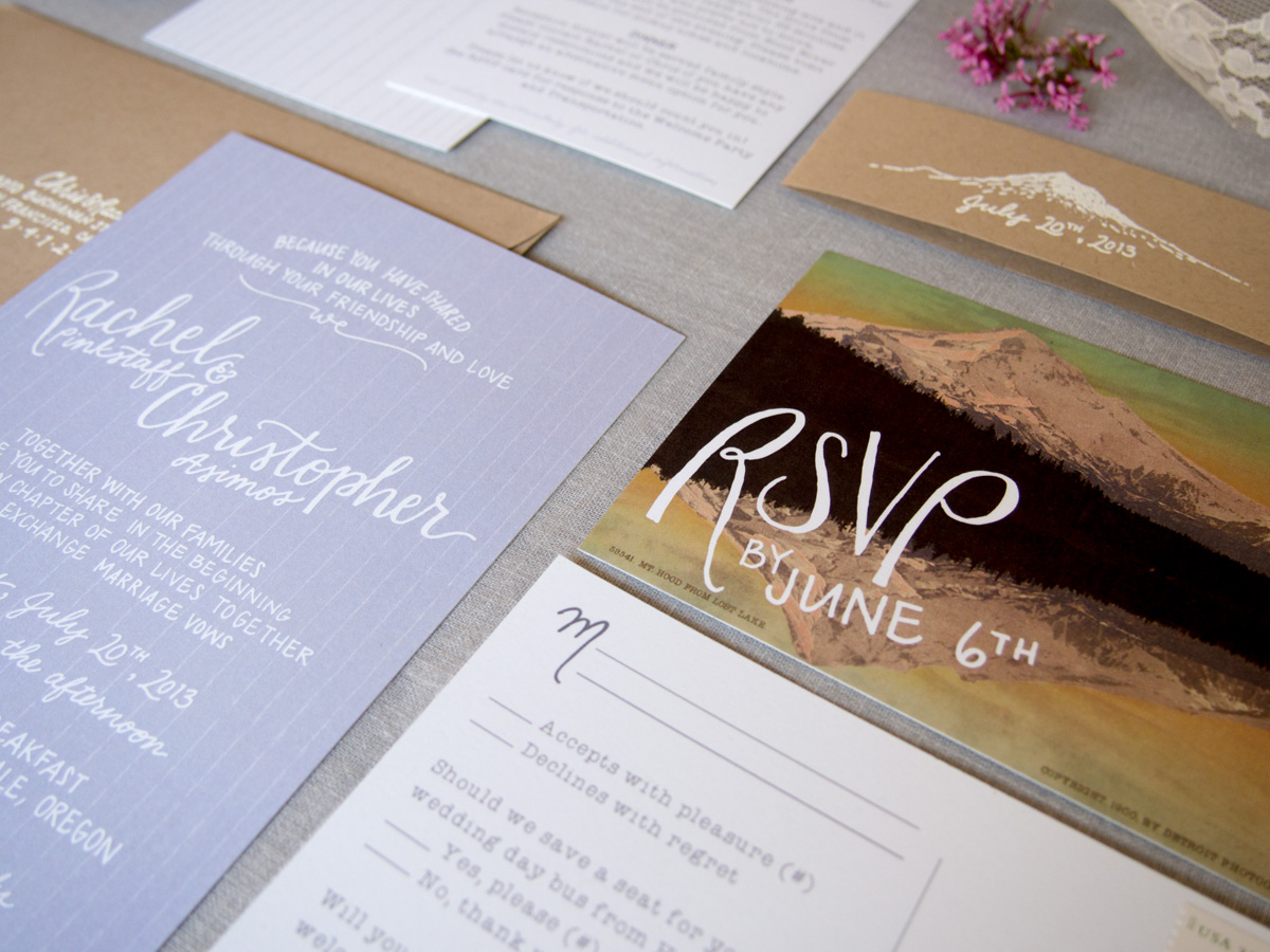
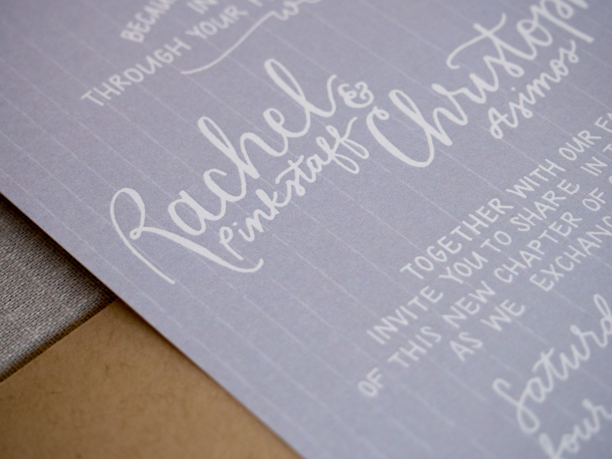
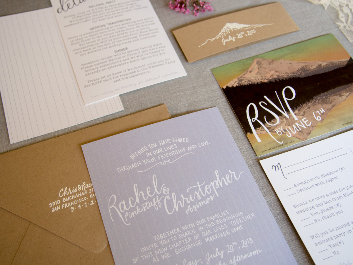
Today I get to show off my invitations! I worked with graphic designer and E&I blogger alum, Kimberly Roth, to create my invitation suite. I love how they turned out.

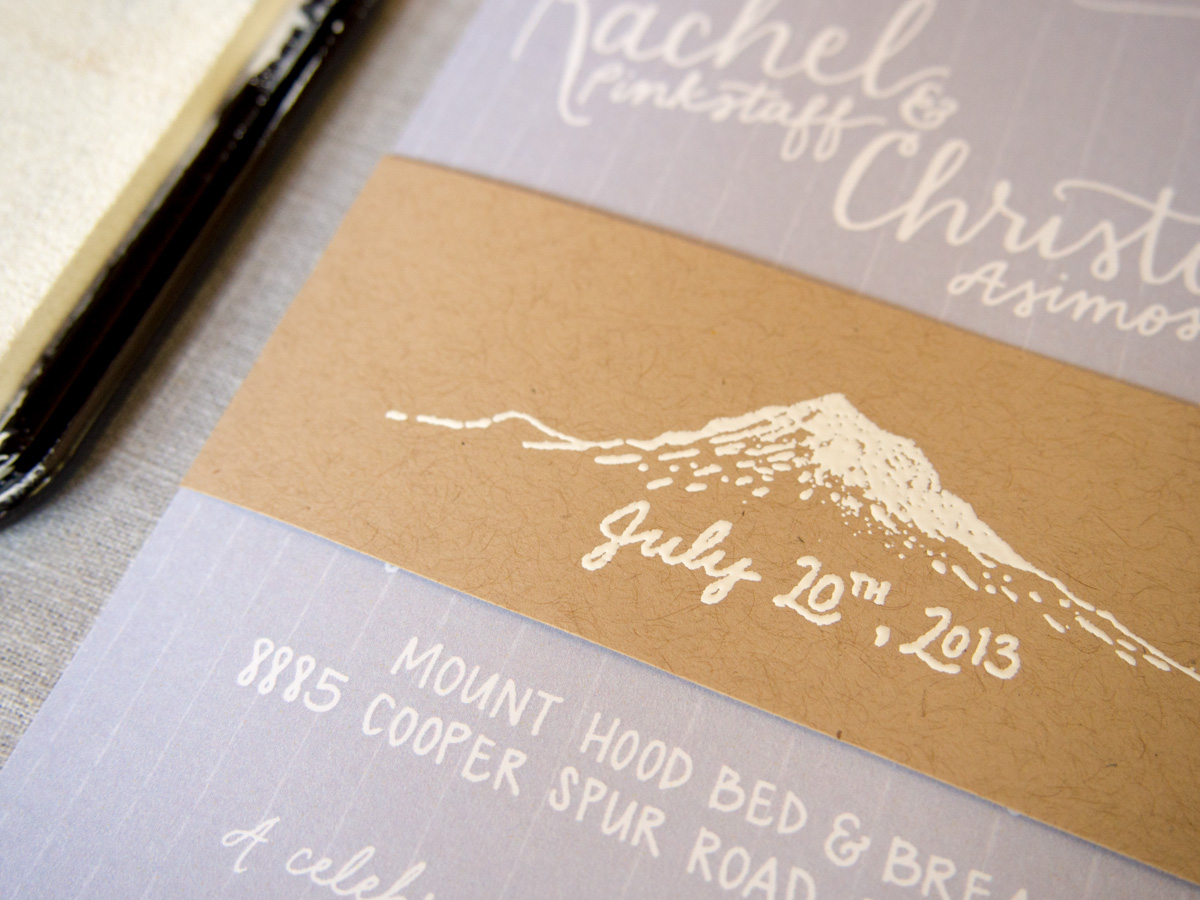
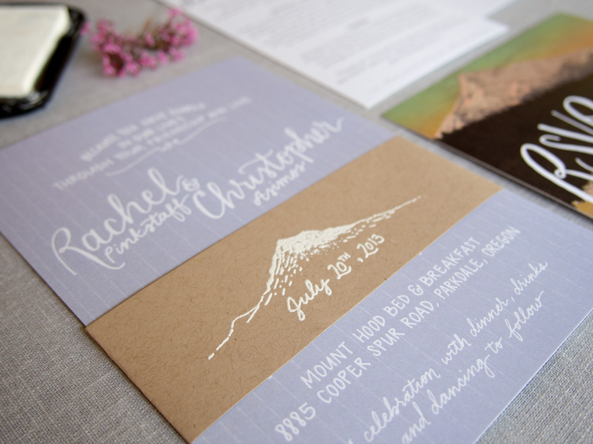
Along the way, I feel that I really solidified the vision I had for my wedding. We pulled inspiration from the location - Mount Hood, Oregon - by featuring the mountain, the muted lavender color from the lavender fields in the area, and the overall whimsical feel.

 BRSD-2   BRSD-5 BRSD-6

BRSD-3Photo credit: Kimberly Roth

I also got a chance for some DIYing. Kimberly designed and coordinated having stamps made for our 'belly band' and return address. During a visit to Paper Source, I realized embossing with white would show up much better on the Kraft paper than just a white stamp. Embossing is really fun and easy (but time consuming when you are doing it for 100+ invitations).

Here's what I used:

- Stamp

- Stamp pad

Embossing powder

Heat tool

Once I got the hang of it, it went by pretty fast. I would stamp three at a time, apply the powder, lay them out on the table (until it filled the table) and then use the heat tool on all of those. Much faster than doing the whole process for one at a time. Two of my bridesmaids came over one night to help and that really speeded things up. Note to self: make sure cat doesn't get to them before you set the powder with the heat. :-)

After embossing, I folded each belly band around the invitation and secured it with a strip of double sided tape.

InvitationsPhoto credit: me

BRSD-4Photo credit: Kimberly Roth

Group Pinterest Boards

One of the most fun things I've done so far with wedding planning is starting a group pinterest board to let friends and family share ideas they came across.  When I first got engaged, people close to me started e-mailing inspiration and I knew I needed to come up with a way to keep it all organized so that I could access it when it came down to deciding on the details.

anna_naphtali_photography_favorites_414$!400x

 Source: Style Me Pretty

So, I started a group pinterest board and sent out an e-mail that if people would like to be involved to let me know and I'd invite them to pin to the board. A couple months later and we're having so much fun with it!  Obviously I've kept my own boards (since I don't want to bombard the group board with the crazy amount of pins I've amassed), so this has been a fun way to separate out the things that other people find that I haven't seen.

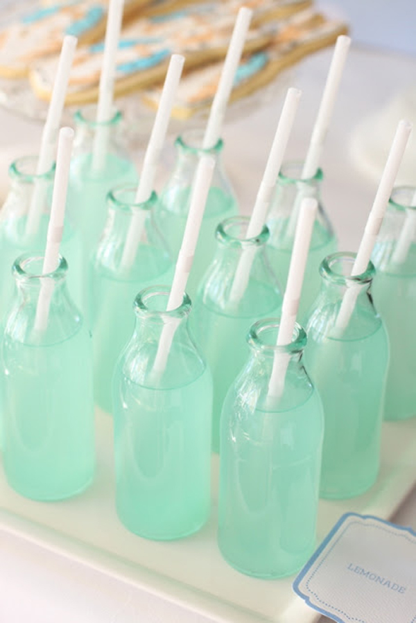
image2

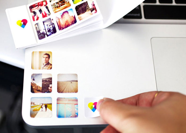
Source: Printstagram

The most awesome thing about it so far is seeing how your friends see your style. So far, everyone has been spot on pinning things I really like and ideas that I think are really creative and fun. Its a really cool feeling to feel like over the years you've developed a style that people have picked up on and that they're so excited about sharing images that fit in with that aesthetic.

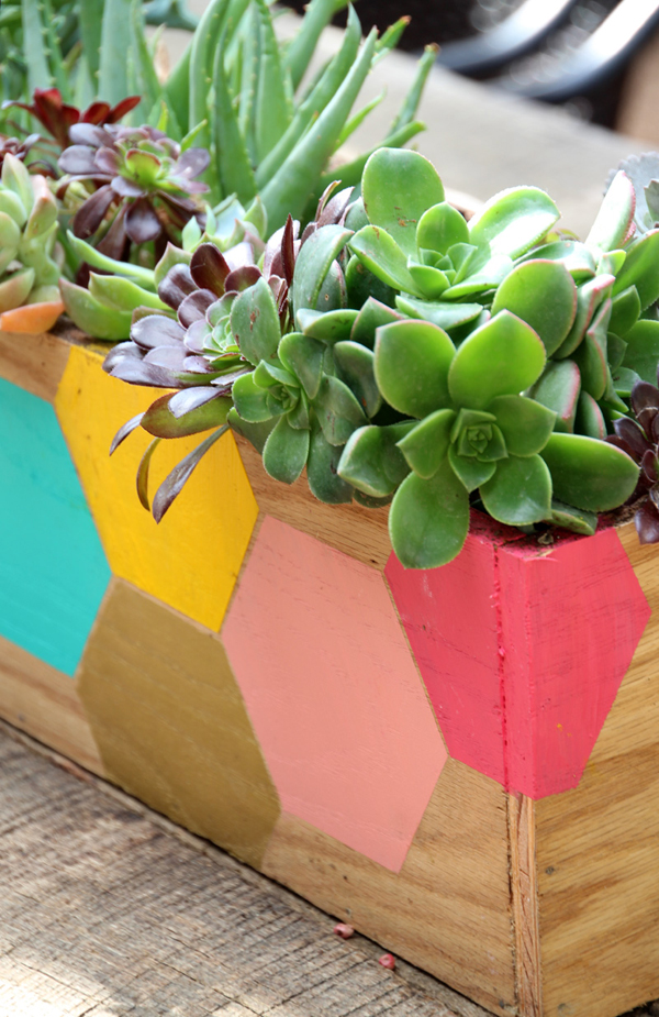
hexagonplanter_finished_closeupvertical2_800

Source: Pepper Design Blog

Its also been a really helpful way to have bridesmaids sharing ideas about dresses, shoes, hair, makeup, etc all in one place so that we can keep the long e-mail chains to a minimum. People can Like or Comment on pictures they find especially pretty and that gives me an idea of what my girls would like once we get down to finalizing options.

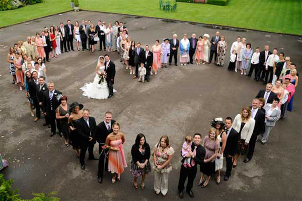
IMG_1375

Source: Hello Naomi

These are all images that friends and bridesmaids have pinned to our board, and even though I get sucked into a ton of blogs, these were all images I hadn't necessarily pinned myself. Its fun to have a lot of sets of eyes out there in the universe to track down inspiration that might be outside of my usual network. Plus, I think they all fit together with our inspiration board really well.

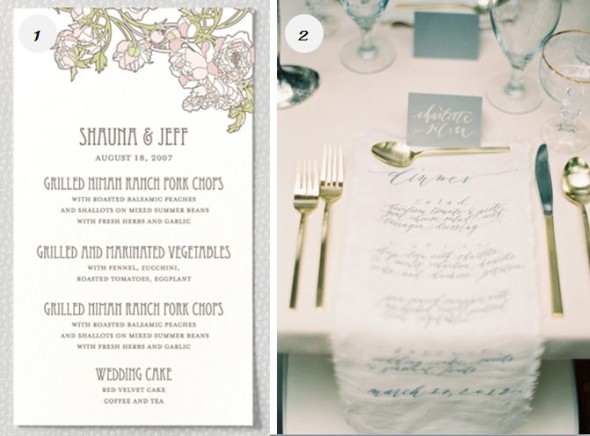
1176

Source: The Wedding Finder

If you're the type of person who gets overwhelmed with too many options, this might not be the road for you, but for me its been a terrific way to keep other people's ideas organized and to start a little wedding inspiration community during the beginning of getting this thing planned!

Designing the Dinner Menu

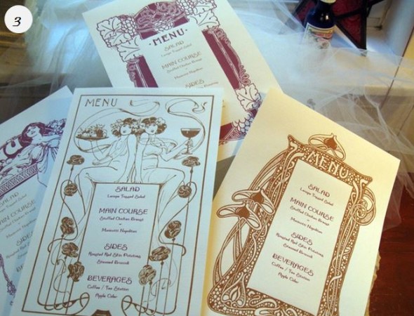
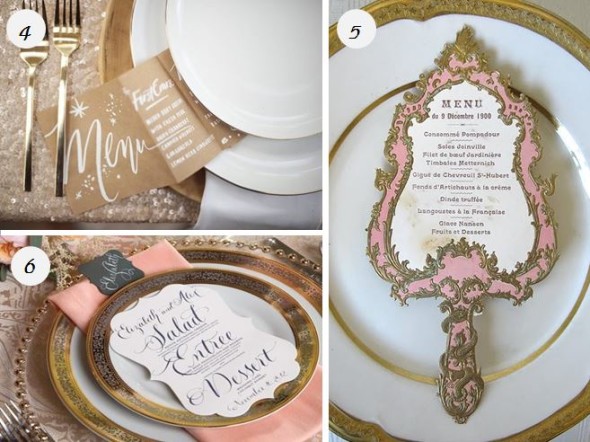
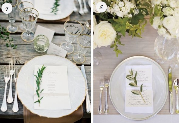
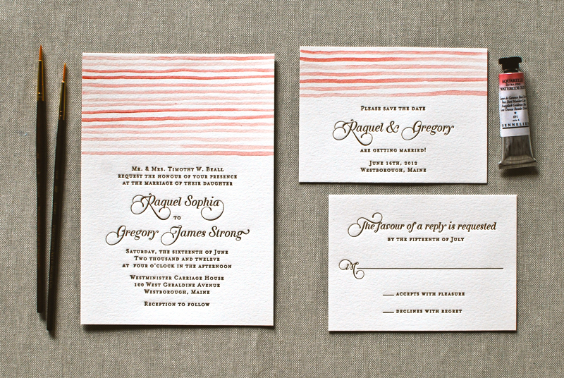
Now that we've finally ordered our invitations, I've been thinking about how all of our paper goods will tie together. As I've mentioned before, we are huge foodies, and are serving our meal family style. Because of that, we want to be sure to highlight the meal in a beautiful and clear way, that will illustrate all of the food on the table. We are still working on finalizing the menu with our caterer, but I love the idea of vintage, elegant menus that complement the mixed metallics and soft flowers of our tablescape. Here are a few options that I'm loving this week.

Sources: 1 (our invitation suite), 2, 3, 4, 5, 6, 7, 8

menus1menus2menus3menus4

Planning a Wine Country Wedding, Part 3: Where did you get that?

As an event designer, one of the questions I’m asked most by both clients and wedding guests is where I find all the unique elements — from the perfect dinner chairs to the adorable ring bearer’s pillow — that make a couple’s wedding uniquely them. For wine country weddings, you typically want thoughtful details that beautifully bridge both rustic and elegant looks. Here I share some of Esla Events' favorite sources.

Paper Goods

Seersucker-Letterpress-Watercolor-Wedding-Invitations-Aerialist-PressSource

The Aerialist Press. They offer beautiful designs – both house and couture collections, and are two of the nicest people you will ever meet, who are inspiringly passionate about what they do.

Little Miss Press. She offers beautiful stationery design AND stunning calligraphy. Getting your invitations designed, printed, and addressed all in one spot? Can’t get any easier than that.


Materials & Special Touches

Millie_890A7744_gardner_smSource


Save on Crafts. For all you DIYers out there, this is a gold mine for materials. From candles to moss to baskets, this national site’s warehouse is located just down south in Watsonville, so getting your items is very quick and easy.

Pressed Cotton. One of my new favorite sites for special little details. The products are tastefully done and well curated.

BHLDN. While some items are overpriced, sometimes you just can’t find that perfect coral cake stand anywhere else. Great for items you think you’ll want to keep long after the wedding.

Etsy. And no list can be complete without this “DIYer outsourcing” site. Sometimes it takes some patience to dig through all the postings, but usually you can find the perfect item at a great price.


Pretty Sweets

MietteSource

Miette. A San Francisco classic, this store just makes you happy. If you can incorporate some of their jaw-droppingly beautiful cupcakes and macarons into your dessert table, do.

Batter. One of my favorite sources for baked goods. Delicious, unique, and beautiful.

Candy Warehouse. There isn’t anything that glamorous about this site or source, but it’s a lifesaver if you’re trying to find a range of candies in one particular shade.


Rentals

Hartmann Studio Rentals. Tip: They have one of the best shrubbery collections in the region. So if you need some olive trees or boxwoods to help define large outdoor spaces, and make ceremony spaces more intimate, this is the place to go.

Wine Country Party & Events. Not surprisingly, their inventory is geared beautifully towards the rustic yet romantic and elegant look of Napa and Sonoma weddings.

Classic Party Rentals. Looking for a great dark-wood farm table? They rent them for $85. Also, their benches and Descanso lounge furniture are quite popular with my clients.

For fans of mid century modern, industrial, and custom design rentals, keep an eye out for YEAH! Rentals and rEvolve (site coming soon!), who will both be expanding their presence in the Bay Area this coming year.


Vintage Touches

homepage-1-ef4780cfdb1ba25ffff8b96ba7dee00eSource

One True Love Vintage Rentals. Incredibly tasteful collection, with exceptionally beautiful pieces for lounge vignettes.

Heritage & Craft. With a beautiful selection of vintage goods, they also are able to craft custom pieces for you.

MilkGlass Vintage Rentals. Her selection of tables and glassware are fantastic, and she also can help you create a customized piece to perfectly suit your needs.

Wine Country Party’s Circa. Need to try and get all your rentals from the same place to avoid multiple delivery charges? Wine Country Party has a Circa line of vintage goods, so you can get 150 standard white plates and 5 wooden crates for styling your dessert table all in one place.


Linens

Napa Valley Linens. Amazing customer service and a constantly updated and beautiful selection of linens.

La Tavola. My clients go crazy for their Tuscano line (which are linen linens). Beautiful understated elegance. They have showrooms in both Napa and San Francisco, making sample viewing a snap.

Happy hunting for your perfect items!

Wedding STD's

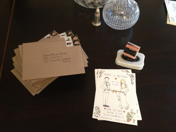
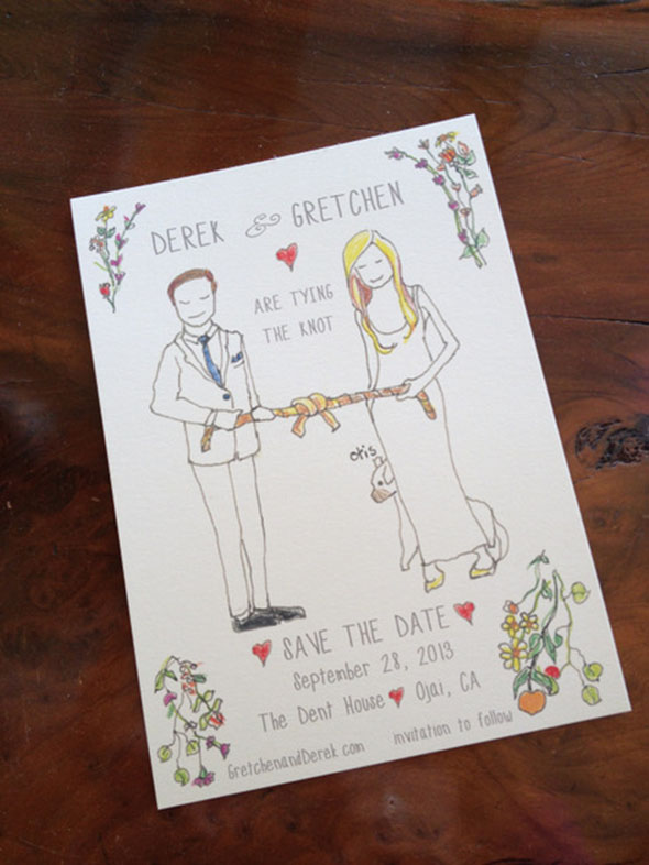
This week I am happy to report that we can cross our Save the Dates (or STD's as we like to call them) off our list!  What I thought would be a simple project somehow turned into a 2 + month project.  When we mailed these out on Valentine's day, I finally started to feel like we are making some progress.

We wanted to do something original so we asked a family friend to draw an illustration for us. We couldn't be happier with the way they turned out!

Now onto the other half of my dress!

Did you design your own Save the Date? How did they turn out?

Planning a Wine Country Wedding, Part 2: The Design

Laurel here from Esla Events for the next installment of our Wine Country wedding series. This week’s topic: designing and styling your big day. There is no shortage of inspiration out there these days, from blogs to magazines to books (my current favorites are this one and that one). So instead of getting into the style of your design, below I provide some tips to consider when styling your designs. None are rocket science but, as any bride can tell you, it's really easy to get so deep into the specifics of your idea that you overlook some styling basics. Think of this as a 7-point cheat sheet for taking your designs from concept to execution successfully, and for getting yourself unstuck when needed. 1. Ask yourself, “What’s behind it?” Sure, you’ve considered the backdrop for your ceremony, but what about your dessert table? Your head table? Your bar? You’ll want these to be in convenient locations that makes sense for access and flow, but don’t forget about the overall visual experience. If there isn’t a gorgeously textured barn wall or natural feature to help frame the component, create one by hanging something (see point #7).

Photo by MEF Photography | Rentals by OTL Vintage | Design and Styling by Esla Events and Amanda O'Shannessy Creative


2. Incorporate a few specialty pieces. One of the easiest and most surefire ways to enhance the look of your day is to rent a few signature items. Even if you don’t have a huge budget, focusing your limited dollars on one or two additions or upgrades can really help elevate your aesthetic. Some favorite strategies include: creating a lounge area with beautiful vintage pieces from One True Love, Heritage & Craft, or Milk Glass, upgrading your napkins and dinner table linens to La Tavola’s Tuscano line, or switching out basic folding chairs for crossback chairs, available at Wine Country Party, Hartmann Studios, and Classic Party Rentals.

 Photo by MEF Photography | Rentals by OTL Vintage | Design and Styling by Esla Events and Amanda O'Shannessy Creative


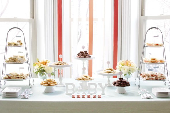
3. Use varying display heights. Use stands, wood crates, or other props to create height on your various stations and display areas. Not sure how to do this? Just check out your favorite boutique or coffee shop for ideas on how to execute this well. The end result is a more friendly, engaging, and visually pleasing design.

Photo and Design by Esla Events


4. When in doubt, use the rule of three. Most items look better in clusters of three, especially when they’re varied in height. Not sure why, they just do.

Photo by MEF Photography | Florals by Leigh Okies Design | Design and Styling by Esla Events and Amanda O'Shannessy Creative


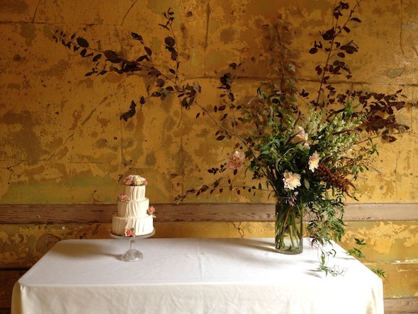
5. Consider the white space. In addition to figuring out what should go where, think about what shouldn’t be there. Giving core design elements breathing room can amplify their visual impact.

Florals by Studio Choo | Photo by Esla Events 


6. Hang something. Many venues in Napa and Sonoma have arbors, wine racks, and other easy-to-hang-from anchor points. Hanging candles, lights, ribbon, signs, and chalkboards are all easy ways to personalize a space, add that romantic touch, and get the most visual impact for your efforts.

Photo by Meg Perotti  |  Florals by Studio Choo  | Rentals by Heritage & Craft  |  Ribbon wall and design by Esla Events


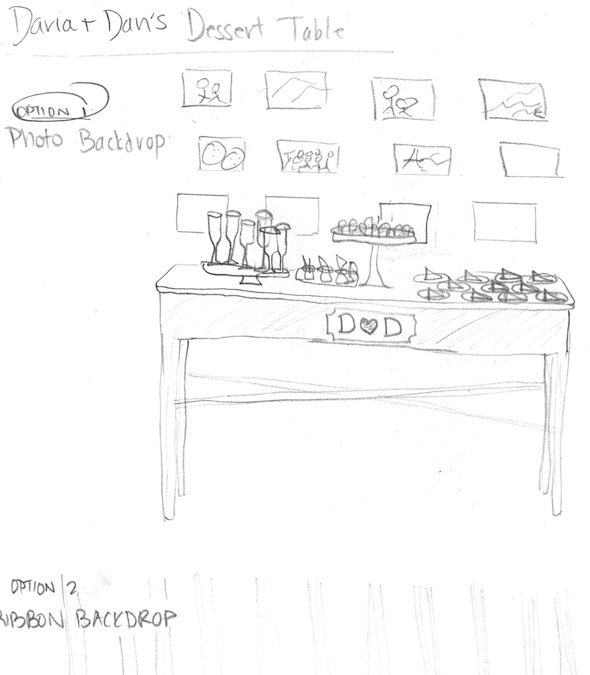
7. If you're not sure whether it will work, prototype it. Sketch it. Count it out. Visit a rental showroom. Make a floor plan. Make a sample. Whatever your strategy, getting the idea out of your head and into a physical form will ensure there are no surprises on the big day, and might even give you additional ideas. And don't be shy! As you can tell from my sketch below, you don't need to be an artist to use this trick—just doodle to get clear on your idea!


Still feeling design-challenged? Consider hiring an event designer to help you flesh out your ideas, help you find all the needed materials and rentals, and handle all the styling on the big day. Or better yet, check out Amanda O’Shannessey’s recently launched workshop series, Styled.