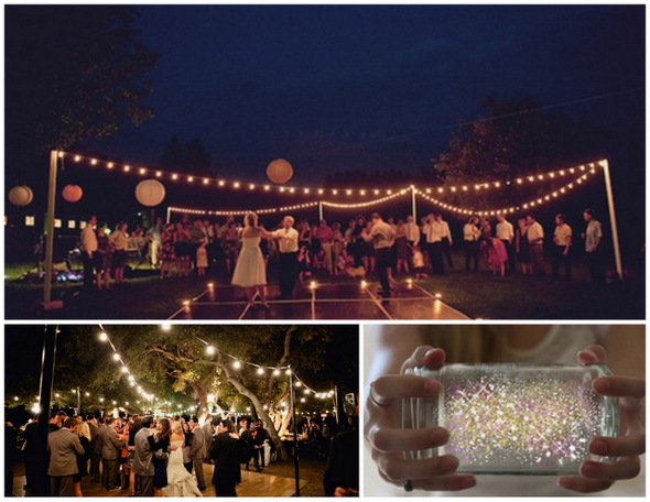
Laurel here from Esla Events for the next installment of our Wine Country wedding series. This week’s topic: designing and styling your big day. There is no shortage of inspiration out there these days, from blogs to magazines to books (my current favorites are this one and that one). So instead of getting into the style of your design, below I provide some tips to consider when styling your designs. None are rocket science but, as any bride can tell you, it's really easy to get so deep into the specifics of your idea that you overlook some styling basics. Think of this as a 7-point cheat sheet for taking your designs from concept to execution successfully, and for getting yourself unstuck when needed.
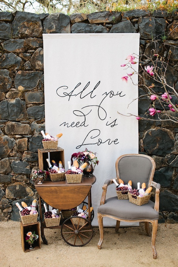
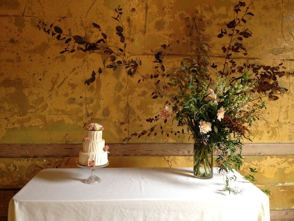
1. Ask yourself, “What’s behind it?” Sure, you’ve considered the backdrop for your ceremony, but what about your dessert table? Your head table? Your bar? You’ll want these to be in convenient locations that makes sense for access and flow, but don’t forget about the overall visual experience. If there isn’t a gorgeously textured barn wall or natural feature to help frame the component, create one by hanging something (see point #7).
 Photo by MEF Photography | Rentals by OTL Vintage | Design and Styling by Esla Events and Amanda O'Shannessy Creative
2. Incorporate a few specialty pieces. One of the easiest and most surefire ways to enhance the look of your day is to rent a few signature items. Even if you don’t have a huge budget, focusing your limited dollars on one or two additions or upgrades can really help elevate your aesthetic. Some favorite strategies include: creating a lounge area with beautiful vintage pieces from One True Love, Heritage & Craft, or Milk Glass, upgrading your napkins and dinner table linens to La Tavola’s Tuscano line, or switching out basic folding chairs for crossback chairs, available at Wine Country Party, Hartmann Studios, and Classic Party Rentals.
 Photo by MEF Photography | Rentals by OTL Vintage | Design and Styling by Esla Events and Amanda O'Shannessy Creative
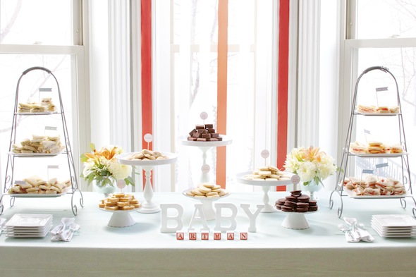
3. Use varying display heights. Use stands, wood crates, or other props to create height on your various stations and display areas. Not sure how to do this? Just check out your favorite boutique or coffee shop for ideas on how to execute this well. The end result is a more friendly, engaging, and visually pleasing design.
 Photo and Design by Esla Events
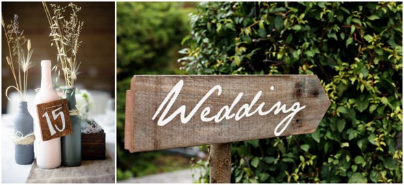
4. When in doubt, use the rule of three. Most items look better in clusters of three, especially when they’re varied in height. Not sure why, they just do.
 Photo by MEF Photography | Florals by Leigh Okies Design | Design and Styling by Esla Events and Amanda O'Shannessy Creative
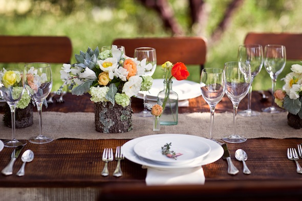
5. Consider the white space. In addition to figuring out what should go where, think about what shouldn’t be there. Giving core design elements breathing room can amplify their visual impact.
 Florals by Studio Choo | Photo by Esla Events
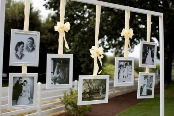
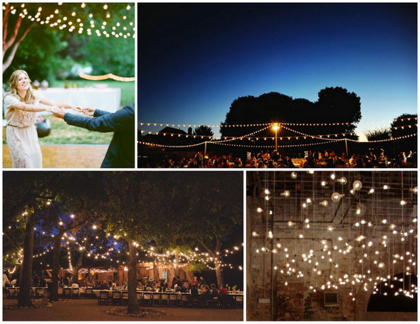
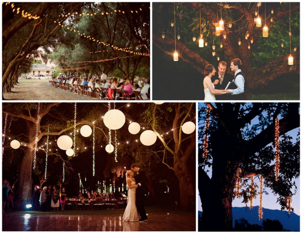
6. Hang something. Many venues in Napa and Sonoma have arbors, wine racks, and other easy-to-hang-from anchor points. Hanging candles, lights, ribbon, signs, and chalkboards are all easy ways to personalize a space, add that romantic touch, and get the most visual impact for your efforts.
 Photo by Meg Perotti | Florals by Studio Choo | Rentals by Heritage & Craft | Ribbon wall and design by Esla Events
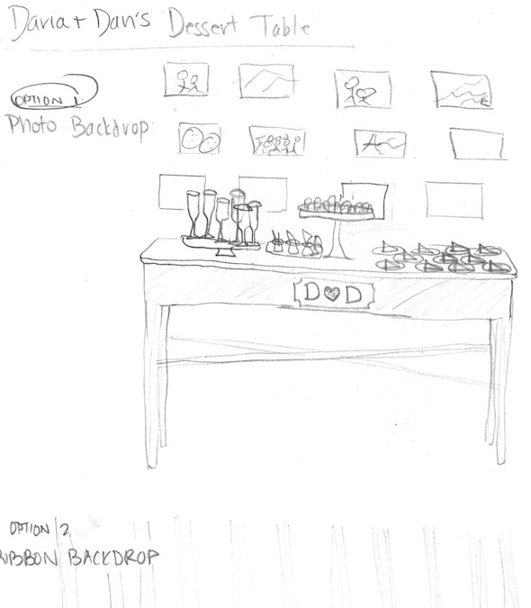
7. If you're not sure whether it will work, prototype it. Sketch it. Count it out. Visit a rental showroom. Make a floor plan. Make a sample. Whatever your strategy, getting the idea out of your head and into a physical form will ensure there are no surprises on the big day, and might even give you additional ideas. And don't be shy! As you can tell from my sketch below, you don't need to be an artist to use this trick—just doodle to get clear on your idea!

Still feeling design-challenged? Consider hiring an event designer to help you flesh out your ideas, help you find all the needed materials and rentals, and handle all the styling on the big day. Or better yet, check out Amanda O’Shannessey’s recently launched workshop series, Styled.
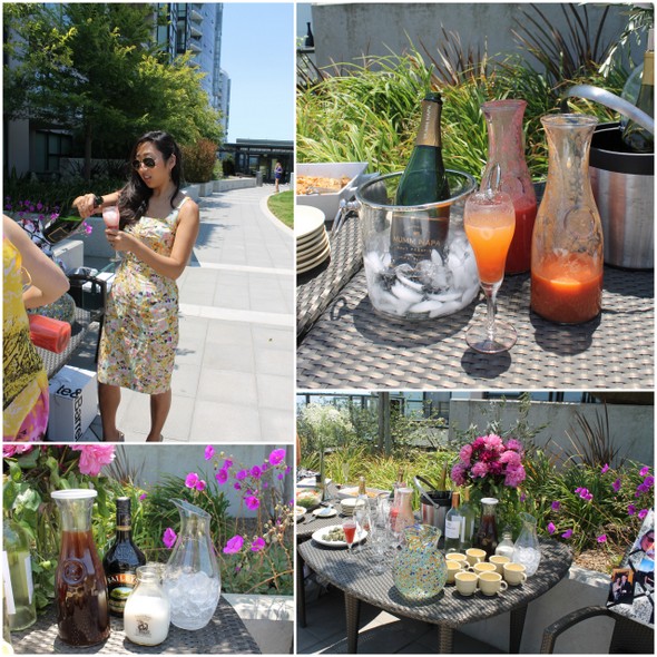
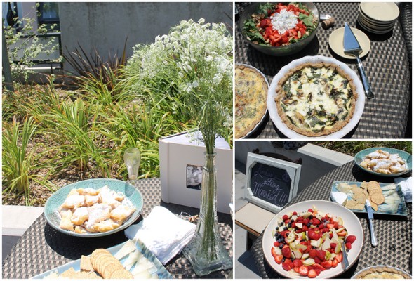
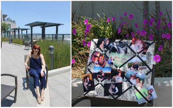
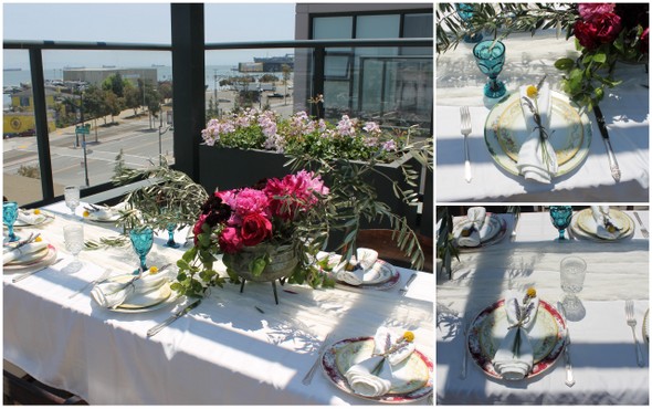
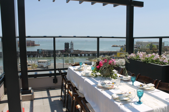 A few weeks ago my girlfriends and I threw a rooftop brunch for our friend who is getting married in August. One of the hosts has an amazing spot in San Francisco's SOMA neighborhood, so the backdrop was taken care of.