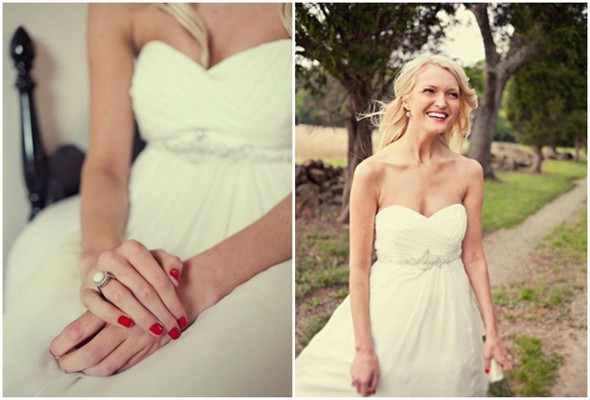
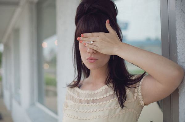
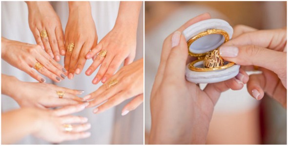
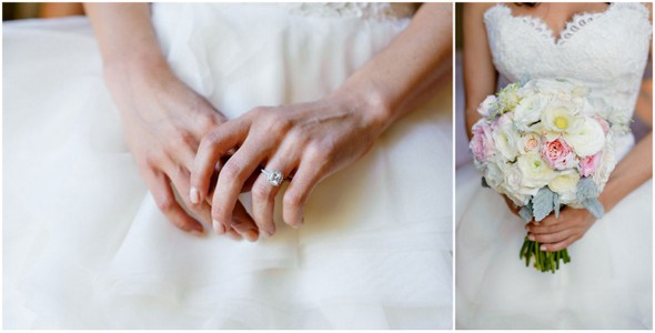
In the months leading up to our engagement, I started pinning images here and there that I knew I would want to fold into our wedding day. I snuck them onto boards called “Sparkle” and “Party Time” but really, I had our someday wedding in mind all along. So when we got engaged, of course the first thing I did was to bring all those ideas back together into one board called “The Big Day” and started to pull out my very favorite images to I could put together a cohesive idea of what I wanted. I wanted to start being able to show people my overall vision in one place.

Source: Ruffled Blog
As I pulled out my favorite moments, it was interesting to see the evolution of this inspiration as Erik and I worked together to decide what our wedding day would be like. I don't think a lot of people talk about how these things come together (since it doesn't just happen out of the blue).
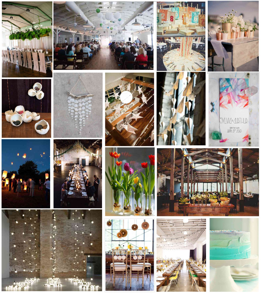
Our first inspiration board was put together entirely by me, and it looked like this:
Sources: Tealily Photography, Ely Fair Photography, Ashley Meaders, Found Vintage Rentals, Design Sponge, The Rubbish Revival, Jeff Loves Jessica, Beautiful Days Events, Spencer Studio, Alexandre Weddings, Kinfolk Mag, Jonathan Ong Photography, Domus, Juli Vaughn, Sweetapolita
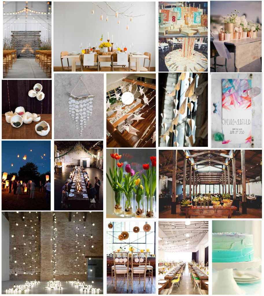
I thought it was so pretty and was what I’d envisioned in the types of spaces we were hoping for our venue. But when I showed it to Erik the reaction sort of fell flat. Sure, he thought it was “pretty”, but he also felt it was a little boring and a little too natural. After all, we knew we wanted a city wedding in the springtime just after he gets home from the Navy, and we weren’t planning on a outdoor summer affair. I swapped out some of the more earthy inspirations with a little bit more fun and funky and came up with this:
Sources (In addition to above): Todd Pellowe, Jeff Loves Jessica
And again, his reaction wasn’t that “Yes! This is OUR big day”. He simply said to me, yeah, its pretty, but where are WE? Where is the COLOR? And that’s true, I love bright bold jewel tones, and so does he. My house is certainly not the monochrome modern oasis that you might expect of an architect. And he doesn’t really have that typical bachelor style.
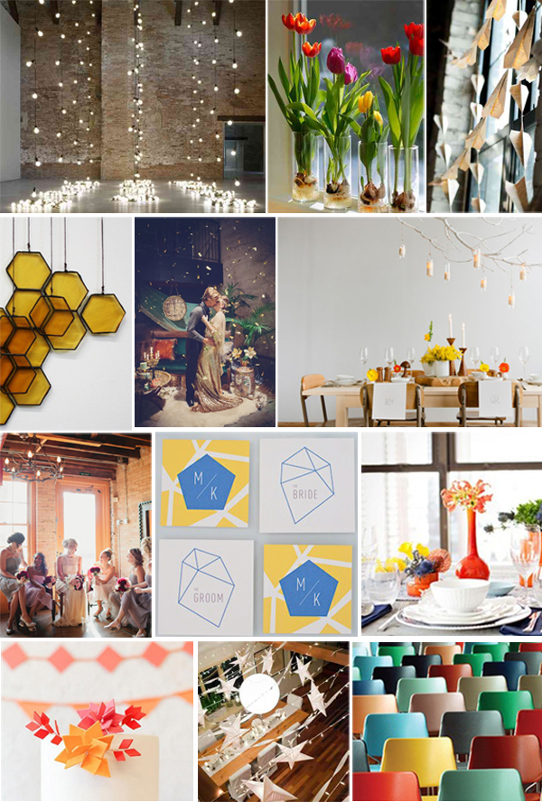
We went back through my pinterest boards together and when we passed this palette he said “Now, I like that!” Which was a pretty cool moment, having him get really excited about our big day. So, I went back through one more time and picked some bolder images and folded them in with the light and texture we’d loved from the beginning.
And voila! Our full inspiration came to life. Its not THAT much of a departure from where we started, but its much more “us” which really makes me happy. And it taught me a good lesson at the beginning of the whole process – which is to really consider decisions about who you are as a couple and not just what the industry or websites are telling you is pretty.
Sources (In addition to above): Bespoke Glass, Marilyn Nakazato, Canary Grey, The Creative Parasol, Sunday Suppers, Nine Cakes, Aurelio Zen
