Tori Spelling’s Inspiring Event (Yellow, Gray and White!)

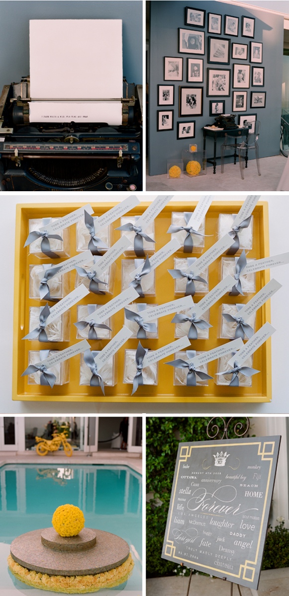
Today I am showing off a bit of inspiration from Tori Spelling & Dean Mcdermotts’s vow renewal ceremony. There were a few things about this event which really caught my eye! First of all, it is imperative to know that I am beyond obsessed with the Gray, White and Yellow color combo! Seeing this just made my day because when someone does this color combo well, it is just a non-stop love fest. First of all, I LOVE this photo area with a typewriter for all to express their love! :) There is a shed space at my venue which is really ugly. This would be a really good solution to covering up that wall, and it is such a great idea! Plus I would love to give people a chance to type something if they so wish.

Cutest favors ever! Just darling! I bought a few of these trays but with a zebra print bottom. I was going to place all the favors or the place cards in them which I feel would be a great touch. I know it will work because Tori Spelling already did it!

That sign they made is just darling! Ok, I'll stop giving you all the spoilers and let you take a look for yourself! Enjoy!
Source: Kiss the Groom

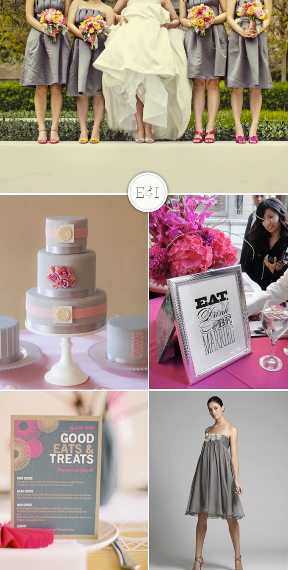
Pink and Gray

I don't happen to be a fan of pink weddings. I later realized that any color wedding, if done right, can be gorgeous. As with any color it is important not to over saturated the area with your color. Spread it out a little bit by adding neutral colors in between. So here we go with a gorgeous pink and gray inspiration board set out to make those haters of pink weddings realize that it can be done right! Pops of color, pretty much my all time favorite wedding term, are far better than a color or theme which takes over.

Do you have a pink and gray inspiration board?? If these are your colors I would love to see what you are working with!

Source: Elizabeth Anne, Amsale, Erica O'Brian, Lotus Haus,  Orange Beautiful, Pretty Cheeky

Real Wedding - Take A Number

My new love of the moment - Stephanie Williams Photography.

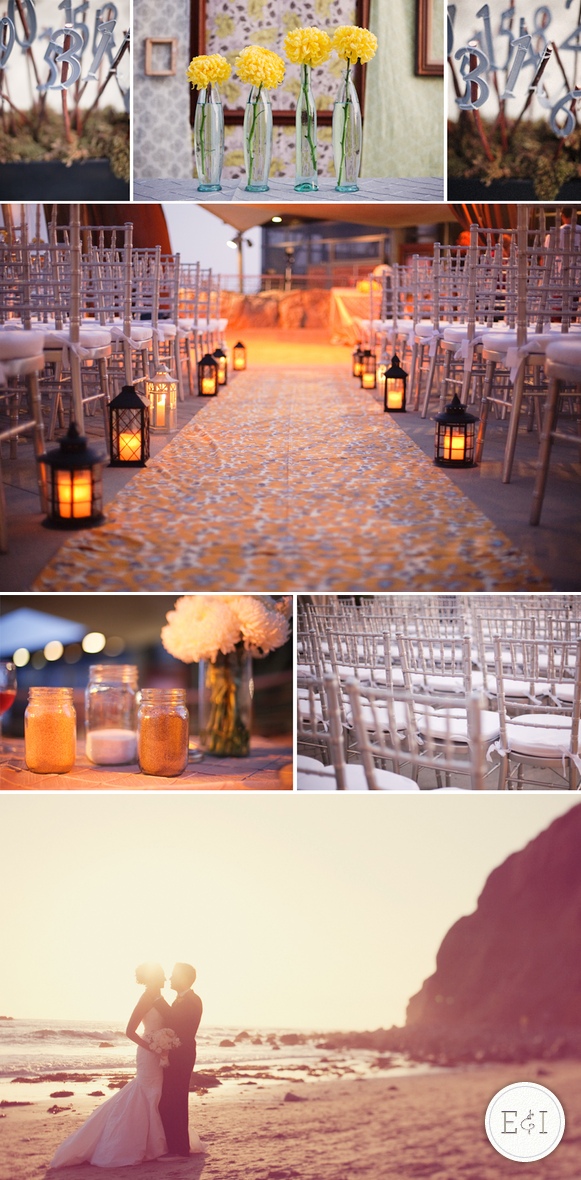
The ceremony space was just gorgeous. Light and fresh yet simplistic. My favorite!

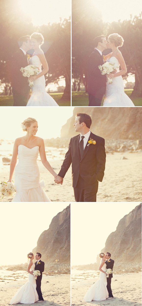
These wedding photos are just phenom-they really are.

The major reason I love this wedding is because the details are so cohesive throughout the space that you don't need too much else. I love that she used lanterns as an alternative to flowers and still made it look just as good.

The numbers throughout the space are just adorable. They solve a functional problem with a chic way of doing it. That is what the detail is really there for, and she did a fantastic job figuring out how to make it all work.

As for the colors, well that's my favorite part! Yellow and gray are so incredible together and do well creating the fresh and fun atmosphere while still maintaining that sense of chic style. To die for!